"Additional Service on PDP" Whirlpool EMEA
D2C E-commerce design Whirlpool Italy. New design for Additional service on product detail page PDP for Whirlpool Italy and France.

Project Background
D2C E-commerce design UX Specialist
PDP on e-commerce Whirlpool EMEA
A product detail page (PDP) is a webpage found on an e-Commerce site that showcases the specifics of a particular product. On this page, customers can find important information such as size, colour, price, shipping details, customer reviews, and other relevant information they may need before purchasing. When designing the Whirlpool website, it's crucial to give PDP special attention. The goal is to present information in an intuitive way, with a clear hierarchy of importance. Knowing this, I had a chance to work on UX/UI, and I can provide excellent solutions that ensure a smooth and user-friendly customer experience. You can rely on me to deliver exceptional results.
Additional service on PDP
At Whirlpool's website, we provide additional services for product detail pages, outlining everything customers and buyers need to know about other services before checkout. With our assistance, you can ensure that your customers have all the necessary information to make the right purchasing decisions. The business EMEA wants to re-design the layout of PDP and PLP, particularly on additional services—the project beginning from Italy and then France. However, the design will be tested and implemented in Poland as well.
Role
Team
Platform
Project Timeline
-
UX research
-
UX/UI Designer
-
UX Specialist
-
Product owner
-
Buiness analys
-
Engineer FE & BE
-
Scrum master
-
D2C leads IT & FR
-
CRO
-
Desktop
-
Apps mobile
-
Two months until sprint
-
July 2022 - August 2022
THE STRUGGLE
Problem with space
Image 1: This is the current "Additional service."
Whirlpool France


Additional services offered on PDP typically include different options for customers. These may be included in the purchase at no extra cost or require an additional fee before checkout—for example, Installation, shipment, guarantee, return policy and more.
On PDP, additional service is already taking space by providing all the detailed information. Both designs feature a dropdown list of supplementary services indicated by an arrow. Users can access detailed information about each service by clicking on the arrow. The pricing is also displayed as a set price or marked free as "Gratuito." For instance, when a service is free in France, it will appear as "Inclus."
Image 2: This is the current "Additional service." Whirlpool Italy
THE GOALS
Utilizing visual elements for maximum impact


Images 3: Design Process, PBR, Customer journey map, benchmarking and user testing
How effective are visual elements on the additional services when offered on the Product detail page, which can contain much information?
-
Not to overload the page with too much information, which will overwhelm users and can distract their attention from the primary goal of making the purchase.
-
On the user testing, To help users understand what specific details are needed for additional items or services, we can use visuals and other elements to provide clues.
THE CONCEPT
Presenting information effectively
The product's features must be easily visible and accessible to users. The users need to see the detail of the information. At this point, Product card detail is significant to provide all these elements. Creating a simple and effective design can be challenging for a UX designer while still providing detailed information.
A new design aims for users to be provided with more detailed information about the features and benefits of the product or service that can potentially interest them and solve their problems. By designing on PDP and PLP, I also need to be concerned for users to elevate the shopping journey with Utility, Usability, Accessibility, and desirability.
How might we elevate the shopping journey by creating simplicity and effective use of visual elements to support information service?
USER TESTING
Operational Simplicity


Simplify the flow
During my exploration of design options, I endeavoured to enhance the layout of the Product Detail page by incorporating key elements such as pricing, features, supplementary services, and information accessibility. Based on my findings, placing the additional services AFTER the CTA button provides a more cohesive user flow.
Image 4: Layout exploration for product detail page
To enhance the quality of service, I have implemented a feature that hides certain details. Users can view the information by clicking on the arrow to reveal more detailed insights.
It seems that this option is not very efficient as it does not provide users with comprehensive information without having to click on multiple buttons. Using multiple boxes to showcase different pieces of information is a great way to save space.


Image 5: Ideation low fidelity
HIGH FIDELITY
Boxes, Icons, label & information

Image 6: Ideation with box and icons
I produced multiple design options incorporating icons, labels, and detailed information to determine their effectiveness in conveying all necessary information. Given the circumstances, I contacted the tech lead and CRM to ask about the availability of brand identity icons from Whirlpool and how we can use them in the VTEX system.
I have created an initial design that includes all icons, labels, and information to ensure a cohesive experience for the user. However, in order to further improve the user experience, I recommend refining the colour scheme and flow of this new design.
Images 7: Design 1 on PDP
Design 1
My aim for the initial design is to seamlessly incorporate all four choices for additional services in their designated sequence.
1. Box and Icons
2. Labels of the service
3. Prices
4. Detail of information


Key Takeaways
I have created an initial design that includes all icons, labels, and information to ensure a cohesive experience for the user. However, in order to further improve the user experience, I recommend refining the colour scheme and flow of this new design.
Design 2


I have successfully created a second design for the conceptual folder file that is far more flexible and interactive than the previous one. It features boxes with icons that function as buttons. Each icon enables users to access detailed information about the respective service.
Images 8: Design 2 and also on PDP
Key Takeaways
Through user testing, we discovered that users often interpret the "Gratuito" label indicating a free item as a clickable option. Nevertheless, some users still find the design confusing and suggest that it needs to be improved.
FINAL DESIGN
Whirlpool Italy

Image 9: Prototyping for PDP WHR Italy


Images 11: Mock-up Additional service for Whirlpool Club Italy


Image 10: Mock-up Additional service Whirlpool Italy
Whirlpool Italy refined their final design during the sprint, building upon the previous one. Users can click on the icon to view detailed product information. Additionally, labels and prices can be selected on the left side by the users.
Whirlpool Italy offers an additional service for their Whirlpool Club products as well.
Whirlpool France

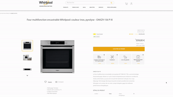
Image 12: Final design Addition service on PDP Whirlpool France


Image 13: Design Box and Icons


Image 14: Design with Boxes, icons & tooltip
Final Design for WHR FR
The company has requested a new design for Whirlpool France with a focus on simplicity, as opposed to the design used for Whirlpool Italy. The product packaging is provided in sets of four, and the quantity may vary depending on the product. Each package is clearly labelled with its corresponding price.
Including an Information Icon in the corner of the layout is highly recommended as a tooltip. This will allow users to easily access detailed information about the content by simply clicking on the icon.
STYLE GUIDE
Design System


MOBILE VERSION

Key Takeaways
The Whirlpool Italy's final design is currently in development and has only been implemented in France at the moment.
Images 15: Mobile version is under development