
"Promozioni" Whirlpool EMEA
D2C E-commerce design Whirlpool Italy. New design for Promotion page "promozioni" for Whirlpool Italy and Implemented in Region France & Poland.
Whirlpool EMEA
D2C E-commerce design UI/UX
Whirlpool EMEA is an essential division of Whirlpool Corporation serving customers in Europe, the Middle East, and Africa. They prioritize sustainability, innovative home appliances, and customer satisfaction. In my role here at Whirlpool, I manage regions in Russia, Italy, Poland, France, Germany and the UK.
Whirlpool uses a Direct-to-Consumer model to sell products through its online platform, giving them more control over the sales process and adapting to changing consumer behaviours. At this project, I was fortunate enough to have a business meeting with a D2C business on PBR, where we discussed potential solutions to the UX/UI problem by sharing user stories from their region.
Promotion page on Whirlpool Italy
Our Promotion page features top deals on home appliances, with categories like "Discounted Products" and "Deals from All Categories". Customers can easily find what they need with our "Handy Filter for Discounted Products Search" and detailed product descriptions and images.
Role
Team
Platform
Project Timeline
-
UX research
-
UX/UI Designer
-
UX Specialist
-
Product owner
-
Buiness analys
-
Engineer FE, BE & QA
-
Scrum master
-
D2C leads EMEA
-
CRO
-
Desktop
-
Apps mobile
-
Three weeks until sprint
-
July 2022

The user confused in between the promotion page and Blog page for wellbeing
The goal of a focus indicator is to allow the user to see and know where they are on a page, by making the currently active element more visible to their eye for promotion page
Promotion only provided my 3 banner in slide section and a little bit of explanation bout the product it self
User’s is confused too many CTA and linked to the same page.
The user’s think the ( 5%) discounted is part of the promotion
THE STRUGGLE
Organizing content & Show relevant CTA
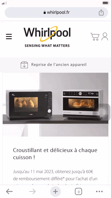
The aim is to revamp the promotion page as it appears too much like the blog page, confusing users who are trying to locate the promotions. Currently, on Whirlpool Italy's promotion page, the discounted products are not displayed on either the product listing or product detail pages. Instead, the page only features banners, which may result in a reduction in the conversion rate for the D2C Whirlpool Italy.
Image 1: This is the current promotion page "Promozioni" for Whirlpool Italy
THE GOALS
Designing for efficiency
The goal is to revamp the promotion pages to improve user journeys and increase retention. Good Information Architecture of a website presents disparate pieces of information to make it easier for a user to navigate, search, and understand. As a UX designer, I prioritize function over form. By analyzing the business D2c user story, I gather the requirements for the website and create a user interface that aligns with those functional needs. I aim to improve the conversion rate by implementing a flexible layout and conducting AB testing with CRO.
This approach ensures a user-friendly experience for visitors to the site. Furthermore, I believe it's essential to showcase the product PLP and PDP to give customers a better understanding of the available products. Overall, the new UI design should be improved as it lacks organization, and several elements are unclear to users.
VTEX e-commerce platform
Whirlpool is using VTex for its e-commerce platform. VTEX is the ultimate e-commerce platform that equips businesses with the power to create their online stores and carry out sales effortlessly. Its advanced features enable you to design your digital store, manage products, process payments, receive purchase orders, and easily consolidate all your user information.
I collaborated with the product owner, business analyst, and lead tech to identify the most optimal UX features that could be seamlessly integrated into our promotion page.

Image 2: Design process for UX/UI, design exploration, benchmarking and PBR
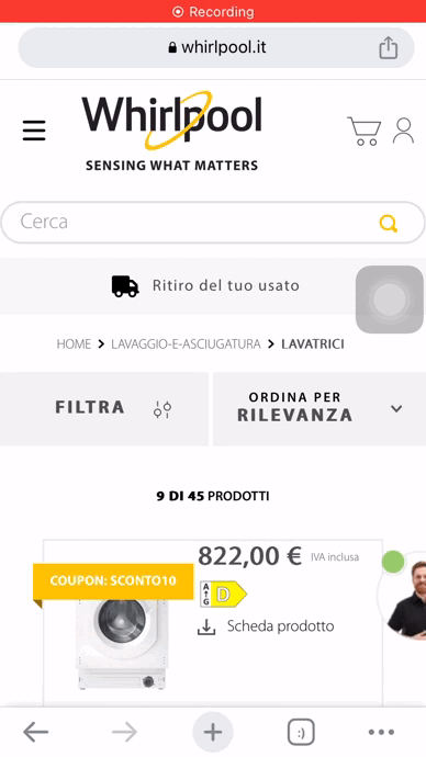
Opportunities from VTEX System
Indication with Hover on header
.png)


Divede all banner promotions
Filter features
PLP for discounted products
Image3: Current Design and leveraging features from VTEX e-commerce Whirlpool


USER TESTING
Improving the user experience journey.
Homepage
The user is unable to locate which page they have opened due to the absence of a visible pointer.
Promotion page
Once users view the banner slide on the promotion page, they are redirected to the blog without revealing the discounted product.
Choosing discounted product
-
The user is unable to locate the specific product they are searching for.
-
There are too many product listing pages that are not properly categorized.
Option to see more
-
The entry point to search for the specific product the user needs seems challenging to locate.
-
Upon reviewing the Gif video of user testing, it is evident that the user encountered significant difficulty while attempting to navigate back. The current design requiring the user to press "filtri" instead of a standard back button is unacceptable. To address this critical issue, there is an urgent need for a new UI design that explicitly streamlines the process for mobile users.
Image 4: User testing for filtre feature on mobile to identify the problem.
THE CONCEPT
User retention is the key to maximizing profits
When redesigning a promotion page, one of the objectives is to increase user retention, which directly contributes to the growth of profits. For UX/UI service, comprehensively redesigns your promotion page, focusing on enhancing user experience. We'll add a promotional indicator on the header and split the promotion into three parts for easier navigation.
Understanding these features can be advantageous for e-commerce businesses as it makes updating content more accessible. However, it can be a hassle for customers to navigate through promotions and purchases.
The Opportunities
-
Ensure that it is convenient for them to locate what they are searching for.
-
Display promotions 1, 2, and 3 on one page and improve the filter for a better customer experience. Make them aware of their options.
-
When selecting from our promotional collections, you will be directed to a comprehensive page about all the products offered.
-
Make it clear to them how to take a desired action.
How might we Incorporate all search options into the promotional section, which is necessary to streamline the checkout process?
IDEATION
Low Fidelity
Promotion page
Promotion 1
product of Promotion 1


Image 5 user flow for promotion page
Image 6 wireframing
MOCK-UP
High Fidelity


Image 8: Mock-up design for desktop for UX/UI promotion page
FINAL DESIGN
Desktop Version

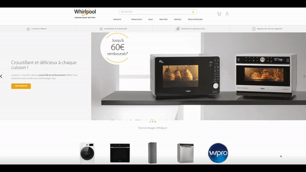
Image 9: Final design for Whirlpool France desktop version
The promotion page has a unique design located in the footer section
Design version 1
Design version 2
Design version 3


FINAL DESIGN
Mobile Version


Images 10: Option mock-up for mobile version Whirlpool Italy
Solution for the filter features
Hide filters with arrows
Highlight chosen categories
Highlight chosen categories
List from your choices


List from your choices


Image 11: Mock-up design for filter features. Mobile version
Key Takeaways
Incorporate all search option
We aim to simplify finding what users need with smooth user flows. Our services include discounted banners and product samples for easy browsing. Our priority is a hassle-free user experience for finding the best deals.
Use Filters
Filters help users easily navigate through a large number of similar products on promotion pages, improving their experience.
This platform is easy to use for both clients and customers.
The redesigned interface promotion page is stellar and will maximize your marketing potential, allowing you to reach your objectives efficiently. I am genuinely ecstatic about this development.

Images 12: Prototyping new filter features for mobile